
““If a picture is worth a thousand words, a data visualization is worth at least a million.””
Estimated reading time: 3 mins
We’ve spent the last few posts exploring data visualization and its benefits as well as mistakes to avoid. Perhaps the best way to learn about data visualizations is to see real-life examples of exceptional data visualizations that are aesthetically pleasing and convey information well. Below you’ll find visualizations that we think fit the bill along with our thoughts on what makes them great.
This interactive visualization cleverly portrays the success of every major movie between 2008-2015. The brilliance of this design is that it is sortable by different factors, color coded by genre, and sized by revenue.

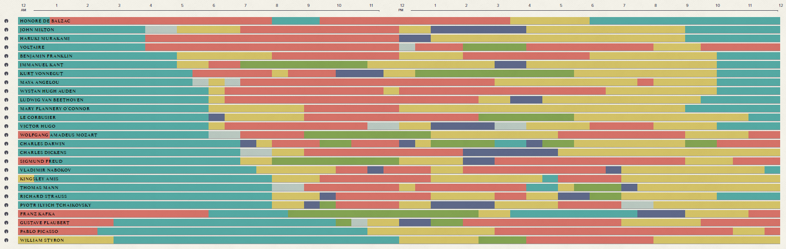
2. The Daily Routines of Famous Creative People
Ever wondered how many hours Picasso slept or Benjamin Franklin spent socializing? This data visualization displays the routines of some of the world’s most famous creative talent. You can sort by type of activity to see how each individual compares to his or her peers or take in the whole graphic at once. What makes this visualization work well is the fact that it’s organized hourly and uses colors to clearly indicate the activity of each person. It’s easy to compare and contrast routines for everyone on the list. What would make this work even better would be a function that compares only select individuals.
3. Causes of Death in Shakespeare’s Plays
The genius behind this infographic is that it harnesses a popular method of data visualization to depict the most frequent ways Shakespeare chose to have his characters die. The original graphic was a pie chart with more than 20 different slices, many representing just one way Shakespeare chose to slay his characters. The word cloud provides an easy-to-read alternative to a complex pie chart. One drawback is that the colors of the words seem to be random; assigning meaning to the colors would improve the word cloud.

If you think you’re looking at a beehive, you’re right. But you’re also looking at an infographic that maps bee-plant interactions for the last 120 years. While this chart is a good example of form over function (there’s no legend for plant types, for example), it is a world above the complex scientific graph created to convey the same information.

5. Why Peyton Manning’s Record Will Be Hard to Beat
In 2014 Peyton Manning broke Brett Favre’s record for career touchdowns; stunningly, he accomplished this mark 56 games earlier than Brett Favre did. To illustrate why Manning’s record will be difficult to break, this New York times data visualization reaches back to 1930 to chart quarterbacks with at least 30 career touchdowns. Manning’s upward trajectory is all the more impressive when compared to quarterbacks over the last 100 years. While the inclusion of so many quarterbacks helps to demonstrate Manning’s accomplishment, the chart is a bit tricky to navigate in places.

6. 13 Reasons Why Your Brain Craves Infographics
A clever company decided to use an infographic to demonstrate why infographics are effective. The result is a webpage that ranks 4th on Google for interactive infographics and has garnered over 27,000 social shares. This infographic is the perfect marketing tool for the company because it illustrates what they create (infographics), why it’s important to have a killer infographic, and the benefits of a good infographic.

As we have seen in this post and ones before it, data visualization can be a great tool to use to convey meaning, harness valuable insights, and add value for clients. Data visualization can also backfire if done poorly. Investing in the right resources, especially in the expertise of a seasoned industry veteran, is one way to ensure your company reaps the benefits of its data visualization strategy. If you’re in need of expert input or market research for your data visualization projects, contact Brian to learn more about Pharma Acumen can help you.
Read more about effective dataviz: