
Estimated reading time: 4 mins
We’ve seen in a recent post the benefits that effective data visualization bring to the table. Not only do they improve deliverables for clients, they also help you understand the current market and better influence your audience.
The other side of the data visualization coin is that poorly executed graphics can be detrimental to the message you are trying to communicate. The examples in this post demonstrate what happens when data visualization goes awry.
1. Numbers Don’t Add Up
Though it might seem obvious, a mistake that’s all too common when using pie charts and part-of-the-whole graphics is including numbers that don’t add up to 100. Here’s an example that comes from CNN:

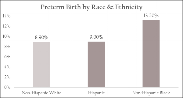
This chart is meant to communicate the fact that African American women are more likely than other women to deliver preterm babies. But, these numbers are confusing when presented this way because the visual conflicts with the data included. When looking at the pie chart, it appears that almost half of babies delivered preterm are African American, instead of 13.2%.
A simple bar chart is a better way to represent this information because it doesn’t skew the audience’s perception of the numbers. It’s easy to read and clearly communicates the main point.
2. Too Complicated
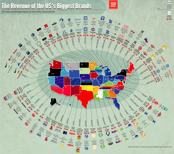
The beauty of data visualizations is their power to communicate information in a succinct and impactful way. Sometimes, though, the complexity of a graphic far outweighs its ability to communicate successfully. This infographic is a good example:

This visual is meant to provide information on the top most valuable brands across the world in 2016. However, the amount information packed into this graphic along with the puzzling candy shop design choice make deciphering it, at best, difficult. There seems to be no rhyme or reason behind the design or the way it’s organized.
Here’s another example of a visualization that is far too complicated:
The version below uses the same data but does a better job of communicating the main point (i.e. the most profitable company in each state) without any distracting additional design elements or information.

3. Skewed Correlation
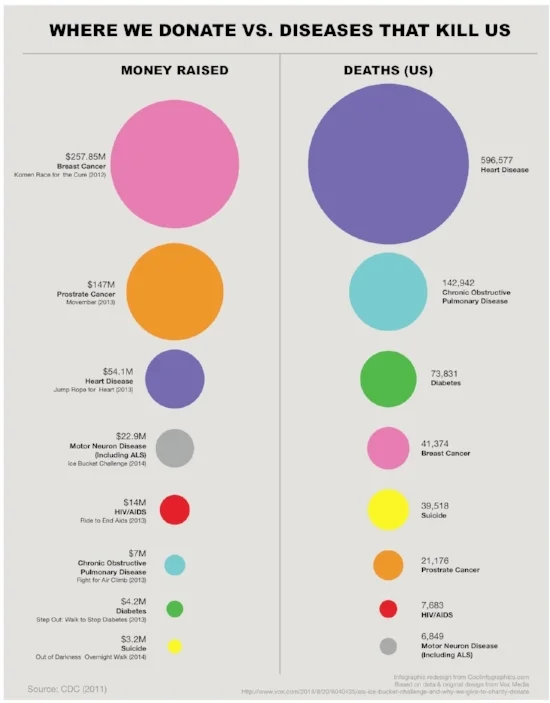
Visualizations of data communicate a message. However, that message can be shaped to inaccurately represent the data being shown. This example is meant to communicate the disproportionate amount of money donated to cure diseases in relation to the number of deaths caused by those diseases:

However, the circles sizes don’t correspond with the values shown. As Randy Krum points out, “This is a false visualization and significantly exaggerates the smaller amounts of money contributed to each charity and the deaths attributed to each cause.”
A reimaged version of this graphic by Krum more accurately depicts the relationship between money donated and deaths caused.
Another example of skewed correlation is this chart that depicts the current populations of China and India and projects expected changes over the next 15 years:
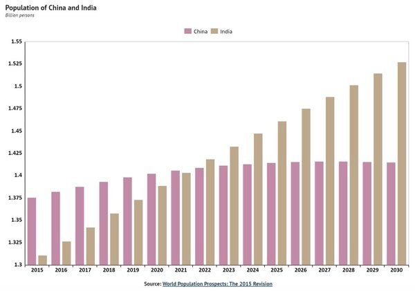
A quick glance makes it seem like in 2015 India’s population was ⅕ of China’s. Because the x axis is truncated, the graph misleads its audience into thinking that China’s population is far larger India. A corrected version of this graphic (with an x axis of 0) makes the effect less impressive and more accurately represents the data.

4. Omitting Key Information
Another common data visualization mistake is to exclude figures and other information necessary for understanding the graphic’s message. The following example depicts the increase in oil production among several countries:

While it’s clear that the United had the largest increase in oil production, this graphic ultimately fails as a tool for helping the audience understand data because there is no data for us to understand. Without any context, we have no way to tell whether the difference between increased production is very small or very large or insignificant. Knowing by what percentage the US’s oil product increased, and how that percentage stacks up against other high-oil-producing countries would be a start.
“If you want to provide a fair picture of what’s going on, you have to expand your scope to show the variables that put things in their proper context. That way, you can provide your readers with a more complete and nuanced picture of the story you’re trying to tell.” Source
5. Not Sticking to Conventions
If the point of using dataviz is to make information easier to understand, bucking certain conventions may be detrimental to your efforts. According to Kaiser Fung, “There should be a very high bar against running counter to convention. Readers do bring their ‘baggage’ to the chart, and the designer should take that into consideration.” Take, for instance, this graphic depicting gun murders in Florida before and after the 2005 Stand Your Ground law was enacted.

At first glance, it seems that the new law significantly lowered gun deaths. However, upon closer examination, we see that the designer here chose to invert the y axis, with the highest number at the bottom of the chart. Unfortunately, this graphic backfired; instead of supporting the data, it nearly contradicts it by making the opposite appear to be true.
Are your data graphics conveying the right message or are they undermining your efforts? Whether you need expert advice on existing materials or are starting from scratch, we have the tools in place to help your company craft compelling visuals that generate insights. Contact Brian today to learn more about what our data visualization services can do for you.
Keep reading about the value of dataviz: